Regime Type and War

Our project aims to describe the impact and interplay of regime-type (e.g. democracy, autocracy) on a variety of unit-level variables. Additionally, we look at the cross sections between many of these other variables to identify correlations in the data that may be independent of our variable of interest. We use three datasets, both independently, and merged together. The Correlates of War (COW) dataset provides information about war initiation, war duration, casualties, and war outcomes. The National Military Capabilities (NMC) dataset provides year-by-year data for each country regarding the size and composition of a given state's military. The Polity dataset provides scores for how democratic a country is in a given year. By merging these three datasets together, we were able to compare material capabilities with democracy values and war outcomes. The visualizations we generated revealed four major insights. First, countries have become more democratic over time. Second, while the size of a country is correlated with military expenditure, the number of military personnel is not. Third, military personnel counts jump more rapidly during times of war as compared with military expenditures. Fourth, the size of a country's urban population (which is itself a proxy for development), is modestly correlated with democratization. By identifying trends in the data, we hope to provide clarity so as to better predict war-related outcomes.

Research Questions Summarized

  • Do changes in democracy correlate with war participation?
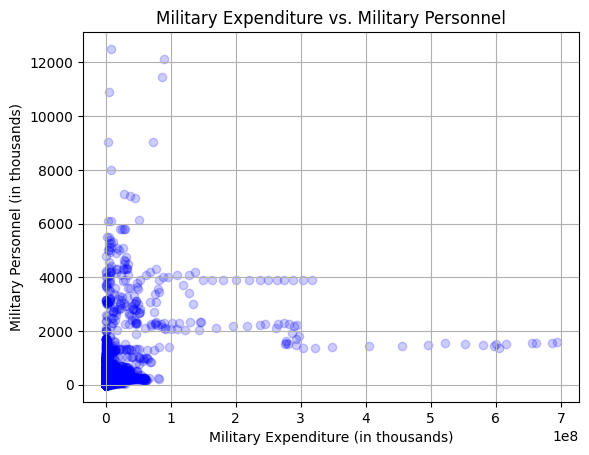
  • Why might a state spend more on its military or military personnel?
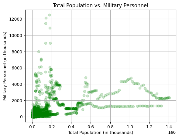
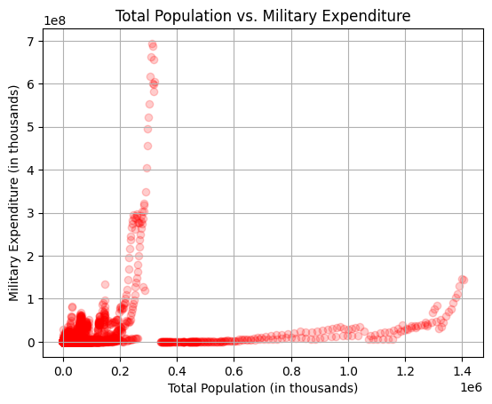
  • Does the size of a country affect the size of a country's military?
  • How has democracy changed over time?
  • Overview

    Data Journey

    Because we accessed, stored, converted, and cleaned three datasets, this section of the project took considerable time and resources, but nevertheless resulted in a fruitful array of insights in regards to our research questions. The data itself was stored in csv files, and the datasets were compiled by the Correlates of War and Polity projects. These non-profit academic organizations are themselves operated by the University of Texas and the Center for Systemic Peace respectively. We picked these datasets because it had a large spread of data on variables of that were statistically interesting. We chose datasets that had overlapping variables so that we could merge the files (country names, country codes, and years). Problematically, the Polity and COW datasets do not have data for every year, and as a result, there were large gaps in the data between the datasets. This required cleaning, so as to seamlessly merge the two datasets together. While ambitious, the learning process was very rewarding and ultimately successful.

    High-level Conclusions

    As stated above, the visualizations we generated revealed four, major insights:

    1. Countries have become more democratic over time.

    2. While the size of a country is correlated with military expenditure, the number of military personnel is not.

    3. Military personnel counts jump more rapidly during times of war as compared with military expenditures.

    4. The size of a country's urban population (which is itself a proxy for development), is modestly correlated with democratization.

    Total Population by Military Personnel

    Insights from the visualization

    1. Population size is not obviously correlated with military personnel counts.

    2. Very few countries are very large or field militaries above 600,000.

    3. The vast majority of cases have a proportionate population and military personnel count, implying that there is an average size that countries' attain, with a possible bell-curve distribution.

    Total Population by Military Expenditure

    Insights from the visualization

    1. The total population of a country is not a good predictor of military expenditures.

    2. Three countries, America, China, and India, stand out as outliers in the data

    3. Countries can rapidly increase their military expenditures.

    Military Expenditure by Military Personnel

    Insights from the visualization

    1. There is little to no relationship between military expenditures and military personnel.

    2. Military personnel counts seem to be highly dependent on previous values.

    3. Very few countries exceed 1e8 dollars.

    War Duration

    Insights from the visualization

    1. World War I and II are the bloodiest conflicts in the dataframe, and involve the highest number of states.

    2. The US is involved in the four bloodiest wars within the dataset

    3. The majority of wars in the dataset occured during the 20th century.

    Military Expenditure Over Time

    Insights from the visualization

    1. Military expenditures have increased over time for almost every country.

    2. The US is far and away the largest spender in the dataset.

    3. Soviet military spending collapsed in 1988

    China's military spending has been rising quickly in the last decade.

    Polity Scores by Military Personnel

    Insights from the visualization

    1. The majority of states used to be autocracies, but now the majority are democracies or near-democracies.

    2. There does not seem to be a correlation between polity scores and military personnel

    3. Generally, army size has not changed much over time.

    Military Personnel Over Time

    Insights from the visualization

    1. Africa, Eastern Europe, and Central Asia are still underdeveloped as compared with the rest of the world in terms of total GDP

    2. Democracies tend to be wealthier.

    3. Countries that are geographically larger tend to be richer.

    Total Population Over Time

    Insights from the visualization

    1. China and India are growing much more rapidly than other countries.

    2. The breakup of the Soviet Union reduced Russia's population by about a third.

    3. Territorial losses (e.g. Bangladesh from Pakistan) have resulted in significant population losses.

    Urban Population Over Time

    Insights from the visualization

    1. Urban population grows much more rapidly than total population.

    2. China has rapidly urbanized.

    3. Urban population is much more susceptible to internal and external shocks.

    Urban Population by Total Population

    Insights from the visualization

    1. Smaller countries tend to be the most urbanized.

    2. The US has urbanized dramatically over the last four decades.

    3. Globally, countries have urbanized.

    Effect of Democracy on War Initiation

    Insights from the visualization

    1. There is no correlation between democracy and war initiation.

    2. There is no correlation between urban population and war initiation.

    3. Countries with smaller urban populations tend to get into more wars.

    Global GDP Over Time

    Insights from the visualization

    1. Africa, Central Asia, and Eastern Europe are less developed.

    2. Eastern Asia, North America, and Western Europe are more developed.

    3. GDP has increased considerably over time, although the breakup of the Soviet Union caused a noticeable decline for Russia in the mid 1990s.

    Map of Democracy Across the World

    Click here to view the visualization.

    References/Data Sources

    We developed our visualizations based on three primary datasets: the NMC dataset (National Military Capabilities Project), the COW dataset (Correlates of War), and the Polity Dataset. The NMC dataset comprises information on states categorized by year, detailing military personnel, expenditures, total population, and urban population. With a vast collection of 16,000 entries, it stands as the largest dataset among the three. The COW dataset offers insights into various wars, providing details on their start and end dates, initiating parties, and casualty counts for each conflict. Lastly, the Polity Dataset measures a country's democratic status on a scale from -10 (indicating full autocracy) to 10 (representing democracy). Countries scoring 6 or higher are considered full democracies. Notably, all three datasets span from the 1800s to the present day, offering a comprehensive historical perspective for our visualizations.

    Correlates of War Project

    Polity Project

    National Military Capabilities Project

    Caveats

    All military expenditure values are measured in US dollars.

    In accordance with Professor Kumar's advice, we have embedded both of the graphics for democracy across the world. The merging worked well, but px.choropleth could not handle the values in the data frame.

    Further intense data analysis is necessary, such as time-series regression.

    About Cecilia Fenton

    Cece Fenton is a management consulting major and collaborative innovation minor in her senior year at the University of Notre Dame.

    About Cullen Geahigan

    Cullen Geahigan is a political science and Russian major in his senior year at the University of Notre Dame.